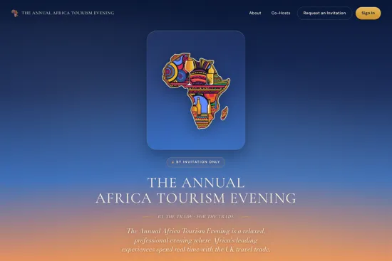
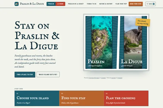
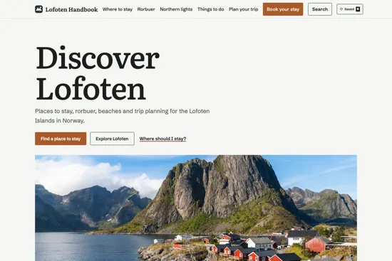
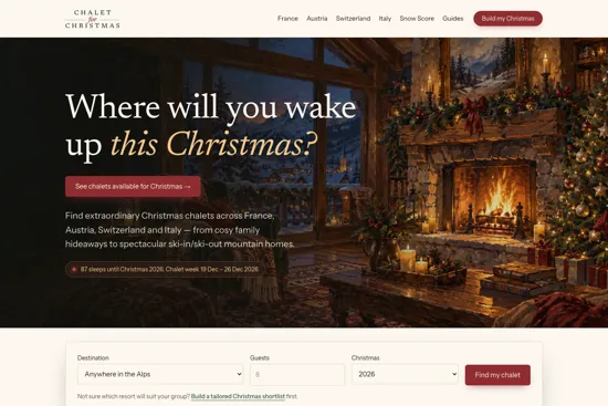
A tourism association website is really two sites in one. There is the public face — the argument for the industry, the case for joining, the directory the outside world uses to find your members. And there is the members' area — the portal that earns the subscription, where the resources, the benefits and the community live. Most association sites do the public half and leave the members' half as a login that goes nowhere. I have sat on the board of a tourism services association and chaired a regional chapter, so the points below come from being a member and a director, not just a builder.
Two sites in one
Your public site is a recruitment and advocacy tool: it tells the industry, government and the travelling public who you speak for and why it matters, and it makes joining easy. Your members' area is a retention tool: it is the reason a member renews. When the second half is weak, members quietly ask what they are paying for — and that is the number that keeps an association's board awake.
What it needs
- A public face with a clear purpose. Who you represent, what you stand for, the advocacy and the wins. This is how you recruit members and how you earn a seat at the table.
- A searchable member directory. The outside world's index of your members — often the single most-used page. Filterable, current, and a genuine benefit of membership because it sends business to members.
- A member portal. A real login area: member-only resources, benefits, documents, forums or noticeboards, and self-service so members update their own listing. This is what a subscription actually buys.
- Join and renew, online. Membership applications, tiers, payment and renewals handled on the site — not by email and spreadsheet. Frictionless renewal is frictionless revenue.
- Event registration. Conferences, workshops, chapter meetings and the AGM — bookings, tickets and attendee management in one place. Events are where associations earn trust; the tech should not get in the way.
- News and advocacy. A steady feed of industry news, position statements and member updates — the visible proof the association is working, and the freshness that keeps you found in search.
What it does not need
- A booking engine for members' products. You represent members; you do not sell in competition with them. Send enquiries to members — do not become a marketplace unless that is a deliberate, mandated strategy.
- A portal so complex no one uses it. A members' area only earns its keep if members actually log in. Start with the two or three things they want and build from there.
What associations get wrong
- An empty members' area. A login that leads to a thin, stale page is worse than no login — it advertises that the subscription buys little.
- A directory that is out of date, because updating it is a manual job no one has time for. Let members maintain their own listings.
- Running membership and events on email and spreadsheets, which does not scale and buries the staff in admin the site should handle.
How to think about it
An association website is a membership engine. The public half wins members; the private half keeps them. The associations that thrive treat the members' area as the product — they ask, seriously, "what would make a member log in this week?" — and they let staff run the whole thing without a developer on call. Having served on a board, I know how much of an association's credibility rides on this working, and how quickly it erodes when it does not.
If you are building or replacing an association site — or turning a dead members' login into something members actually use — let's talk. If you are scoping it, here is what drives the cost of a trade website.
Common questions
What does a tourism association website need?
A tourism association website is two sites in one, so it needs: a public face with clear purpose and advocacy that recruits members; a searchable, current member directory; a member portal with member-only resources, benefits and self-service; online membership applications, tiers, payment and renewals; event registration for conferences, workshops and the AGM; and a news and advocacy feed. It does not need a booking engine that competes with its own members.
Does a tourism association need a member portal?
Yes — the member portal is what the subscription actually buys. A login that leads nowhere is worse than no login at all, because it advertises that membership delivers little. A useful portal gives members resources, benefits, a self-service listing and a place to connect, and it is the single biggest driver of renewals. Start with the two or three things members want and build from there.
What is the difference between the public site and the members' area?
The public site is a recruitment and advocacy tool: it tells the industry, government and the public who the association represents and why, and it makes joining easy. The members' area is a retention tool: it is the reason a member renews, holding the resources, benefits, directory self-service and community. The public half wins members; the private half keeps them.
What do tourism associations get wrong on their websites?
The common mistakes are an empty or stale members' area that makes the subscription feel worthless; a member directory that is out of date because updating it is a manual job no one has time for (members should maintain their own listings); and running membership and events on email and spreadsheets, which does not scale and buries staff in admin the site should handle.